News
How To Select Eye-Catching Colour Combintations - Part 2. The Colour Wheel
Planning your colour scheme for colourwork projects can be difficult. Knowing exactly which colours to put together to form a pleasing colour arrangement can be a very daunting task. Not any more! This week we'll be exploring the colour wheel and explaining why this simple little colour map should become your 'go-to guide' for selecting amazing colour combinations.
So, how can a colour wheel help when choosing colours for colourwork? According to colour theory, harmonious colour combinations (or colour schemes) can be found on a colour wheel by simply using a number of formulas. Knowledge of these formulas will give you immeasurable help when selecting colours for colourwork, or any project that uses more than one colour. Once you get the gist of it, you'll find yourself using these formulas without even thinking about it. There are many formulas, but we will be concentrating on monochromatic, analogous, diad, triad, complementary, split complementary and tetradic. We'll look at the pros and cons of each formula, as well as suggesting some tips that you might find helpful when knitting with each of these colour schemes.
The colour wheel is often left out of a knitter's tool kit. Why not get one to put in your notions case or, even better, get an app for your phone or tablet? That way you'll always have one on hand.
Monochromatic Colour Combinations
Monochromatic colour combinations consist of colours ranging from light to dark within a single hue (for example, blue).
Pros
- Selecting colours for this type of colour scheme is easy and the results are subtle, yet very pleasing.
- Allows you to choose a number of different colours: i.e. you're not restricted to just two or three.
- Produces a balanced, calming effect.
Cons
- Very low in contrast - you need to make sure that the colours you chose differ significantly in tone (see part 1.)
Tip! To test for contrast, twist all colour strands together. If the colours merge together, you'll know there is not enough contrast.
Analogous Colour Combinations
Colours placed next to each other on the colour wheel make up an analogous colour combination. These type of colour combinations are often found in nature and are very pleasing to the eye.
Pros
- Just like monochromatic colour combinations, they are easy to select.
- This color scheme looks a lot more vibrant than monochromatic colour combinations.
- You can choose as many colours as you like.
Cons
- These colour schemes can lack contrast, so it's vital that you make sure that there is enough variation in tone for your colourwork project to pop!
Tip! Avoid using warm and cool tones together in analogous colour combinations.
Diad Colour Combinations
Diad colour combinations are made up of two colours, found two steps apart from each other on the colour wheel.
Pros
- These look great in colourwork and are perfect for those who are wanting a colour scheme that is less vibrant than complementary colours.
- A simple colour scheme that is easy to put together.
Cons
- The contrast between colours is not as strong as complementary.
- Limited to two colours.
Triadic Colour Combinations
Triadic colour combinations are made up of three colours that are spaced evenly around the colour wheel.
Pros
- Gives you a nice balance of colour that is high in contrast.
- These colour combinations tend to be quite vibrant, even if you use pale or unsaturated hues.
Cons
- Not as vibrant as split complementary colour schemes.
- Limited to three colours.
Tip! To use this colour combination successfully, let one colour dominate and use the other two as accents.
Complementary Colour Combinations
Complementary colours are found on opposite sides of the colour wheel.
Pros
- When used together, these colours create vivid and bright colour combinations, more so than any of the other combinations we have looked at.
- Fabulous for stripes.
Cons
- Can be jarring and hard on the eyes. To help ease this, make sure you use different tones (e.g. a light colour paired with a dark).
- Limited to two colours.
Tip! When using complementary colours, try placing warm tones next to cool.
Split Complementary Colour Combinations
Split complementary colours are a variation of the complementary colour scheme: one colour is paired with two colours that are on either side of the complementary colour.
Pros
- Perfect for three-colour knitting.
- Provides a high contrast between colours.
- This type of colour combination is hard to mess up and almost always results in a pleasing colour scheme.
Cons
- May be harder to create a balance between colours. If so, you may be better off trying the monochromatic or analogous colour combinations.
- Limited to three colours.
Tip! To highlight warm tones in your project, use a single, warm colour against two cool, OR if you want the cool colour to take center stage, place it next to two warm colours.
Tetradic Colour Combinations
Tetradic colour combinations are also known as double complementary because you are using two pairs of complementary colours. The first picture shows a rectangular colour scheme, the second is a square.
Pros
- Creates a rich and vibrant colour scheme.
- Lots of contrast.
Cons
- This is the hardest of all colour schemes to balance.
- Limited to four colours
Tip! To help balance this colour combination, make sure you have an equal amount of warm and cool colours.
Cool and Warm Colours
Colour wheels are split into two sections: cool colours on one side, warm colours on the other. Selecting a balance of these colours means making sure that you have the same number of colours on either side of the colour wheel. Mixing warm and cool tones works especially well with triadic, complementary, split complementary and tetradic colour combinations but should be avoided in analogous colour combination.
Tone
I know I spoke about tone last week, but I again wanted to emphasise its importance within a colour scheme. The colour wheel pictures that I have used do not show tone; there are colour wheels out there that do, like this one. If you're looking to get one, try and find one that illustrates tone. Using the above colour formulas and combining those with your knowledge of tone will, without a doubt, produce eye-catching colour combination.
Using Neutrals
Neutrals don't appear on the colour wheel but they make wonderful additions to any colour combination. Neutral colours are shades of grey, black, white and sometimes brown and beige. Try adding one or more neutral colours to any of the above combinations to liven them up and expand you colour palette. The example above shows a split complementary colour combination with grey.
To Sum it all up
- The colour wheel is an important tool that will help you choose harmonious colour combinations.
- Keep in mind the pros and cons of each colour formula when selecting colours for colourwork.
- Never forget to vary tone within a colour combination; this is really important for the overall success of your colour scheme.
- Try adding neutral colours to your colour scheme; they help to liven up your colours and expand your color palette.
I hope you have found this post helpful! Next week we'll be looking at where to find inspiration for colour combinations and how to use this inspiration when selecting colours for eye-catching combinations. If you've found this post useful, please let me know in the comments below and be sure to share it with your fibre-loving friends.
How to Select Eye-Catching Colour Combinations - Part 1. Tone
Selecting multiple colours for colourwork projects can be a daunting task. There are just SO many colours and SO many choices that it can become really overwhelming. Fear no more! Over the next few weeks I'll be sharing some tips about how to put together eye-catching colour combinations. This week we'll be looking at tone.
Tone is defined as the lightness or darkness of a colour.
It's a well-known fact that tone plays a huge role in making or breaking a colourwork project. Tone, quite simply, is the lightness or darkness of a colour. When it comes to colourwork, you want your colours to vary in tone as much as possible. If there is not enough variation in tone, colours will simply fade into one another and the colourwork pattern will be lost. There is, however, a simple 'light, dark and bright' method that I use when selecting colours, that will help you focus on tone when you're selecting yarn for your next colourwork project.
Light, dark and bright
To explain the light, dark and bright method, let's pretend that you're wanting to knit the very popular Colour Affection shawl by Veera Välimäki (pictured above). Say you're shopping online or browsing through your LYS, looking to buy three skeins of sock yarn in different colours to make this shawl. Start off by selecting one colour, something that really draws your attention; this will be the colour that you will use to base your other choices on.
Tip! If you're shopping online, use the cart to help visualise your colour combinations. Most carts will display your yarns in a list formation, which makes it easy to see what they will look like together.
Step 1. Decide if the colour that you've just chosen will be the light, dark or bright tone in the trio. For example, I chose Citrine, a greenish yellow and I've decided I want this to be the light colour in my project.
Step 2. Now that I have my light colour, I need to select two more colours that are darker and brighter. These colours don't have to come from the same colour group, they just needs to be darker and brighter in tone. So, after looking around I've chosen a navy blue that will act as the dark tone in the trio.
Step 3. I have my light and dark colours, all I need now is a bright. Again it doesn't have to belong in the same colour group, it just needs to be brighter than the other two skeins. You want this colour to really pop! I've chosen a bright fuchsia.
And here is my colour combination:
When knitted up, this trio of colours will contrast really nicely together because they all differ significantly in tone: one is light, one is dark, and one is bright.
Tip! For a never-fail colour trio, select a light and dark neutral of the same hue (for example, grey) then add a bright pop of colour like fuchsia, lime or yellow.
What happens if you're wanting to select only two colours?
For projects that only require two colours, like the Daybreak shawl by Stephen West, you can still use the light, dark and bright rule, but this time you only need to select two tones - a light and dark, a light and bright, or a dark and bright. In the picture below we can see that Stephen West chose a dark brown with a bright rusty orange. Both colours contrast really nicely against each other; as you can see, the orange really pops against the dark brown.
What about projects that require four or more colours?
For projects that require more than three colours, like Kate Davies' beautiful Fair Isle cardigan Cockatoo Brae which is worked with six contrast colours, you will need a selection of light, dark and bright colours. It's really important when selecting colours for fair isle designs that you use the light, dark and bright rule - otherwise if you use colours that have a similar tone the colours will merge together and the design will be obscured due to lack of contrast. Don't be afraid, just use the three steps mentioned above. First, select a background colour. If it's a light background (like Cockatoo Brae), make sure the rest of the colours are darker and brighter or, if the background is dark, choose light and bright colours. In Kate's design, she chose a light, white background with contrasting bright pops of red, yellow and blue, and dark green and purple.
Tip! Use an image editing app on your phone or tablet to test tonal differences between colours.
Photographic Evidence!
You've gathered your yarns, but you're still not sure if there is enough difference in tone between each colour. Don't panic, this is where technology comes to the rescue! Grab your mobile phone or tablet and take a picture of all your skeins side by side. If you're shopping online you can still use this method: all you need to do is take a screen shot of your cart, or simply use your phone or tablet to take a picture from your computer or laptop. Now, upload the picture to Instagram, VSCOcam or any other photo editing app that enables you to add a black-and-white filter. After you have turned your picture to black and white, you will easily be able to see if there is any difference in tone between your colours. For example, let's look at the colours that I chose above for the Stripe Study shawl. Here they are again in colour, and below in black and white:
As you can see, there is a huge difference in tone between these three colours. The first colour is a light grey, the second is a dark grey/almost black and the third is a medium shade of grey. We can now be confident that these colours will contrast nicely, and thus make an eye-catching colour combination. Now let's look at another example, one which shows a colour combination that has little or no difference in tone:
See how, in the black-and-white picture, there is little-to-no difference in tone between these three colours. They all appear to be a similar shade of grey. This particular colour combination would not contrast well together and should be avoided.
To Sum It All Up
- Tone is the most important factor that can make or break a colourwork project.
- For a colourwork project to pop vibrantly, each of your colours must differ in tone.
- To help you focus on tone when selecting colours, use the light, dark and bright method.
- Use an image-editing app on your phone or tablet to test tonal differences between colours.
I hope you have found this post helpful! Next week we'll be exploring the colour wheel and how to use it when selecting colours for eye-catching combinations. If you've found this post useful, please let me know in the comments below and be sure to share it with your fibre-loving friends.
Friday Highlights
Wow, Friday's sure creep up quickly! I did miss last week, sorry about that! I've had a very busy week and some VERY good news which I will share with you all soon. BUT first thing I would like to do is congratulate Allison who is the winner of the Dale sock kit! She said she would knit the Dale socks using "In the Navy" as the main color and "Penny for your Thoughts" as the contrast. I think that sounds perfect! Please contact me to claim your prize.
So, this week I'm highlighting my favorite Instagram feeds. I am a total Instagram fanatic, there are just so many talented people out there, I am inspired everyday.
From top left - thekitchenwitch, thecraftsessions, bmandarines, chiefandkewpie, warpedthreads, blockshoptextiles, iamalchemy, woollenflower, clo._
Other feeds that I absolutely love but couldn't link to are - designsponge, moonstitches, foxslane and truelymyrtle.
What are your favorite feeds, I would love to know?
Have a wonderful long weekend!
xx
Friday Highlights
Over the past five years, I have had the pleasure of working with designers from around the world who have incorporated Skein into their designs. With shawl season fast approaching, I thought it would be the perfect time to highlight a few of these designs.
Barndom by Stephen West which featured Top Draw Sock in the Hazel colourway. This wonderful design has all the features of an enjoyable and easy project - garter stitch, slipped stitches and stripes! The great part about striped shawls is selecting the colours, make it bright and full of contrast or soft and neutral. Whatever the case this shawl is a lot of fun to knit and wear.
Zébulon by Ariane Caron-Lacoste, this pattern was first released in 2011 and featured Vintage Lace in the colourway Quill. Although Vintage Lace is no longer available it can be substituted with our Silk Merino Lace. The design features easy lace stitches, which would be great for those who have yet to try lace knitting, and it only requires one skein! I love the light, open feel of this shawl, it really is a perfect spring time accessory.
Miss Woodhouse by Paulina Popiolek which featured Merino Silk Sport in the colourway Silver Rose (very similar to Mademoiselle). This stunning lace shawl is for those who want a bit of a challenge, designed for intermediate to advanced knitters this shawl features short rows, patterning on both sides and cables. It truly is beautiful and would make a wonderful wedding shawl or accessory for a special occasion.
Forellen by Playsweetmusic Design which featured Top Draw Sock in the colourway Sea Salt. Knitted sidewise, this shawl features a stockinette body, beautiful cable details and an i-cord edging. Its simple and modern with just the right amount of detail - I think it would look just as wonderful using a bright colour or using a contrast colour for the edging.
Give-away winner!!
Before I go, I am delighted to announce the winner of the Darling Dotty shawl kit! Congratulations to
Friday Highlights
This week we are highlighting yet another new design, this time from the lovely Molly of A Homespun House who designed these super cute socks called Dale. Knit using a traditional Fair Isle design (that was inspired by a similar design used by Molly's grandmother and great grandmother) the Dale socks are knit cuff-down and use Skein Top Draw Sock, in the colourways Barley and Quill.
And if the Dale socks weren't cute enough, Molly has also designed a pair of socks for babies and toddlers called Suesie Dale♥. These are also inspired from a pattern knit by Molly's grandmother and great grandmother and feature a very handy i-cord tie to stop the socks slipping off little feet. Knit from Skein Top Draw Sock, Molly used Geisha and Quill with the contrast colour being Barley. So sweet!
You can check out more of Molly's designs over on Ravelry, she has a wonderful website called A Homespun House that sells project bags, patterns and more, plus she also has a wonderful video podcast that I highly recommend!
Giveaway!
Thanks to Molly we have a Dale sock kit to giveaway which includes the pattern plus one skein of Top Draw Sock and a mini skein in a contrasting colour, your choice of colourways! To enter please leave a comment and tell me what two colourways you would chose to make the Dale socks. One entry per person please, winner will be announced Friday 27th March.
Have a wonderful weekend!
Friday Highlights
This week I'm very happy to be highlighting a brand new shawl design by the talented Libby Jonson called Darling Dotty which uses two skeins of Skein Merino Silk Sport. This lovely feminine shawl features an all over dotty pattern that adds a subtle hint of texture which is finished with a sweet bobble border.
Darling Dotty is crescent shaped, which is so easy to wear and the light, drapey fabric makes a perfect transition piece as we head into autumn here in the southern hemisphere or spring in the north.
Darling Dotty is available as a Ravelry download, all information can be seen here. Libby has a wonderful blog called Truly Myrtle, she has also just started a new podcast under the same name. You can check out more of Libby's designs here.
Giveaway
Thanks to Libby we have a Darling Dotty kit to giveaway which includes the pattern plus two skeins of Skein Merino Silk yarn, your choice of colourway! To enter please leave a comment and tell me what colourway you would chose to make the Darling Dotty shawl. One entry perperson please, winner will be announced Friday 20th March.
Have a wonderful weekend!
Friday Highlights
A new addition to the blog - Friday Highlights is all about showing off customer projects. I am so inspired by people's projects that I though it would be a great idea to share them here every Friday.
Knitter - Christine (aka. yarnaboutyarn)
Pattern - Feather and Fan Cloud by Veera Välimäki
Yarn - Skein DK in the Just So colourway
Check out Christine's project page here.
Knitter - Dianne (aka. Goodgirlsaturday)
Pattern - Climb Every Mountain by Heidi Kirrmaier
Yarn - Skein DK in the Champagne colourways
Check out Dianne's project page here.
Knitter - 9crafty11
Pattern - 3 Color Cashmere Cowl by Joji Locatelli and 3 Colour Cashmere Beanie by 9crafty11
Yarn - Skein Merino Silk Sport in the colourways Wild Apple, Sterling and Sugar
Check out 9crafty11's project page for the cowl here and for the beanie here.
Knitter - Mary (aka mmlt)
Pattern - Just Knit It by Susan Ashcroft
Yarn - Skein Top Draw Sock in the colourway Neon and Grey
Check out Mary's project page for here.
Knitter - Susan (aka supizoo)
Pattern - Crosshaven by Rich Ensor
Yarn - Skein Top Draw Sock in the colourway Raku
Check out Susan's project page for here.
Thank you to Christine, Dianne, 9crafty11, Mary and Susan for allowing me to share your projects.
Have a wonderful weekend!
Madewell
This week we are thrilled to have our yarn featured in Joji Locatelli's newest design Madewell.
Madewell is a simple, easy to wear cardigan with a special design feature - elbow patches! These are of course optional, but really why wouldn't you want them.
Joji used Skein Slinky to create Madewell, this yarn however has sadly been discontinued - BUT you can easily substitute this yarn for our Merino Cashmere Fingering. The colourway Joji used is called Quill.
Details and pattern download can be found over on Ravelry!
All images courtesy of Joji Locatelli
Gifts for Fibre Lovers
This year I've had a wonderful time searching for artisan made gifts both online and locally. Not only do I believe that it's important to support small, artisan businesses, I also believe that these hand crafted items make wonderful unique gifts. So, with Christmas just around the corner, here's a selection of some of my favorite gift ideas (sourced through Etsy) that I'm sure most fibre enthusiasts would love.
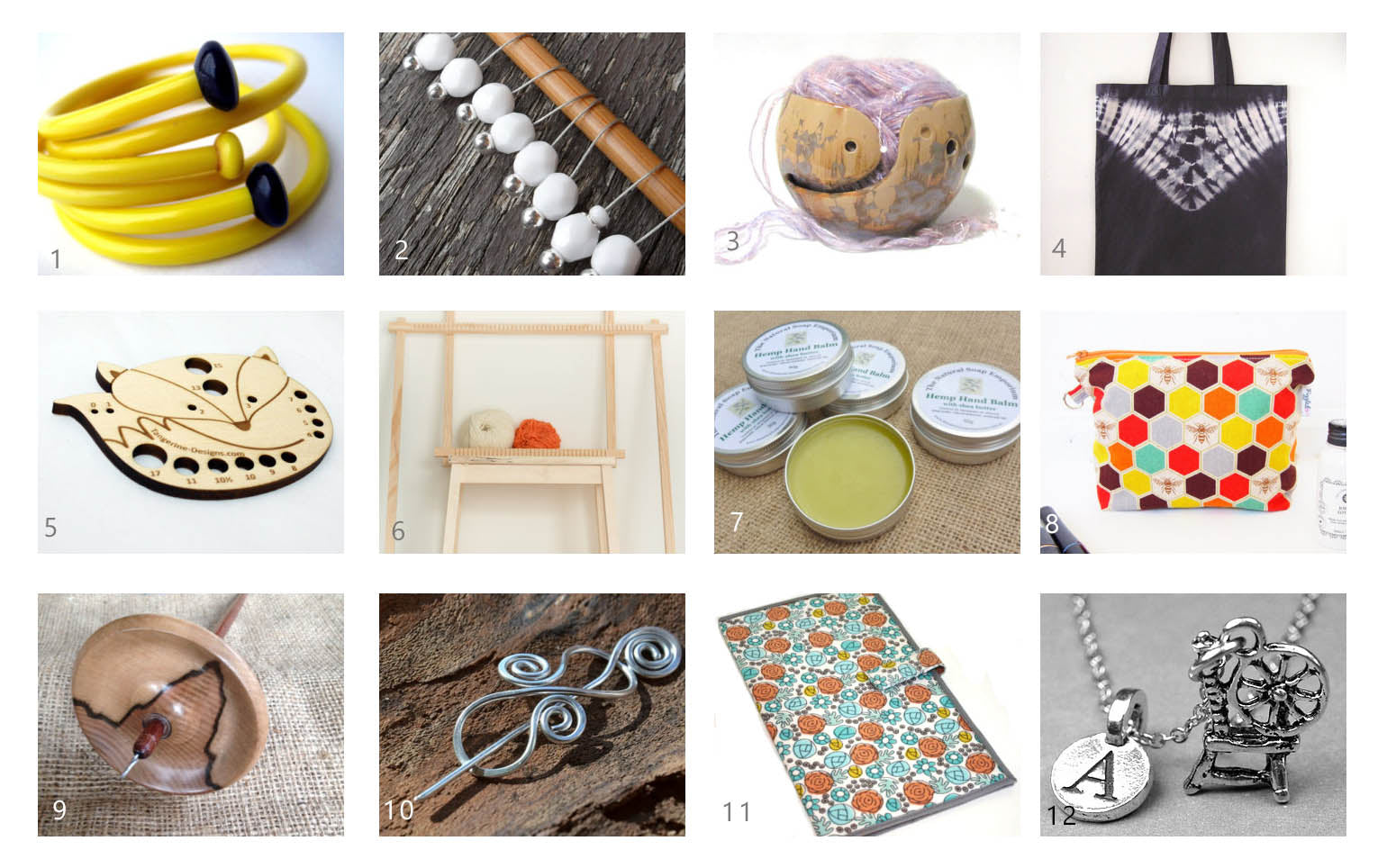
1. Recycled Vintage Knitting Needle Bracelet by Sewnewthings
2. Stitch Markers by Chaton Designs
3. Knitting Bowl by Sunbird Pottery
4. Shibori Dyed Project Bag by Kimi Silks
5. Fox Needle Gauge by Tangerine Designs
6. Weaving Loom Starter Kit by Loom and Spindle Australia
7. Organic Hemp Hand Balm with Beeswax and Essential Oils by Natural Soap Emporium
8. Makeup Pouch (or notions bag for crafters!) by Piggledee
9. Blackheart Sassafras and Blackwood Drop Spindle by Luxury Overdose
10.Celtic Wire Shawl Pin by Rebbeltjes Touch
11.Pattern Wallet by H+T Studios
12. Spinning Wheel Necklace with Personalised Monogram Letter by Chrys Designs Jewelry
Feel free to post your own suggestions below, I would love to be enabled ;)
xx
Incentive
This week we are thrilled to reveal yet another wonderful collaboration. We have teamed up with Polish designer Hanna Maciejewska, who has turned two skeins of our DK yarn into a beautiful shawl design called 'Incentive'.
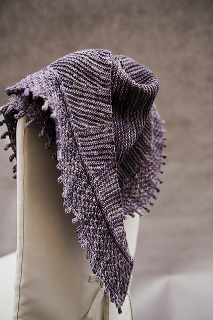
Incentive is the perfect accessory for cold winter days: it's large enough to wrap around, keeping you warm and cozy and the crescent shape is easy to style and will stay put around your shoulders. As you can see in the picture above, Hanna has used two different stitch patterns on the body and edging of the shawl, adding a pleasing 'visual' texture which is topped off beautifully with the picot edging.
The beautiful textual design of this shawl calls for a subtle semi-solid or tonal colourway (Hannah used the tonal colourway Storm). Below are some of my colourway picks:
Incentive is now available over on Ravelry. You can see more of Hanna's designs here and check out her inspiring blog 'Life Is A Stitch'.
Giveaway!
Thanks to Hanna, I will be giving away a pattern as well as two skeins of Skein DK to make the Incentive shawl (winner's choice of colour) to one lucky reader/podcast viewer! All you have to do is tell us in the comments below which Skein colour you would choose to make this beautiful shawl. Entries close on December 8th; the winner will be chosen using a random number generator and announced on the blog. Entry is limited to one post per person.
Have a wonderful week!
xx
Shawl pictures courtesy of Daniel Maciejewski
Sale!
28th & 29th Nov - 20% off sale
From Friday 28th until the end of Saturday 29th of November (AEST), we will be offering 20% off all items on our website. This includes pre-orders for 30 of our speckle-dyed colourways on your choice of yarn base (see preview here)! Just use the code SALE2014 when checking out.
This will be the last sale for some time, so don’t miss out!
Hope to see you there!
xx
NB:If you’re looking to purchase some speckle-dyed colours, they will be located on the update page during the sale.
Clairière
In collaboration with Swedish designer Anna Martina, of Playsweetmusic, we are very proud to present Clairière, a beautiful two-colour shawl knit using Skein Merino Cashmere Fingering. Anna drew inspiration for this design from the Swedish forest, wanting to 'illustrate the sun glittering through the holes in the leaf covered ceiling'.
Clairière is a triangular shaped shawl knit from the top down, which can be easily sized to suit personal preferences. It's great if you want to use up every last bit of your yarn! Sample is shown in colourways Gingko, for the main body, and Fallow, for the edging. With a two-colour shawl like this, it's fun to play around with colour combinations. Below are some of my favorites:
Clairière is now available over on Ravelry, as well as on the Playsweetmusic blog. You can see more of Anna's designs here.
Giveaway!
Thanks to Anna, I will be giving away a pattern as well as two skeins of Skein Merino Cashmere Fingering to make the Clairière shawl (winner's choice of colour) to one lucky reader/podcast viewer! All you have to do is tell us in the comments below which two Skein colours you would choose to make this beautiful shawl! Entries close on December 8th; the winner will be chosen using a random number generator and will be announced on the blog. Entry is limited to one post per person, please.
Have a wonderful weekend!
xx
Shawl pictures courtesy of Anna Martina