Journal

Should I Alternate Skeins? Yes, And Here's Why...
Knitting with hand-dyed yarn is such a pleasurable, visual experience. Hand-dyed colours are complex and the fabric they create displays a wonderful depth of colour that can't be matched by commercial yarn. However, when choosing to knit larger projects using hand-dyed yarns without alternating skeins, you may be a little less than impressed with your finished object. And by 'larger' projects I'm referring to sweaters and cardigans or projects that require more than one skein of the same colour. Truth is, knitting these types of projects using hand-dyed yarns takes much more work than its commercial counterpart, but the end results are stunning and well worth the extra effort. Today we will be looking at the technique of alternating skeins when working on larger projects and why, when it comes to hand-dyed yarn, it is so important. I'll also be adding links to some video tutorials at the end on how to alternate skeins when working in the round and when working flat.
Colour Blocking
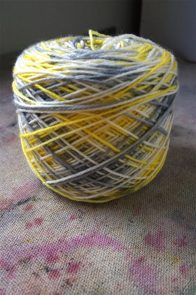
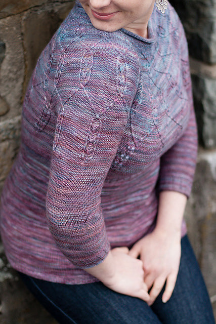
Colour variation within a dye lot is a very normal occurrence in hand-dyed yarn. There are various reasons why colour variations occur: fluctuations in temperature, water level, dye and mordant amounts to name but a few. Sometimes these colour variations are obvious. For example, one or two skeins might be a lot lighter or darker than the others. However, there are times when these variations won't be visible until after you have started knitting with a new skein. Unintentional colour blocking is the term used to describe this kind of knitting dilemma, where one skein is either lighter or darker than the rest, which results in a colour-blocking effect. I learnt the hard way (see the pic below), and ever since I alternate skeins ALL the time.

You can see that the bottom section of the cardigan is lighter and more purple than the rest of the garment. If I had alternated skeins, the variation in colour wouldn't be noticeable. Alternating skeins solves the problem of unintentional colour blocking by ensuring an even distribution of colour and a much nicer finished piece (and happier knitter!).
Mismatched Dye Lots
Because hand-dyed yarns are dyed in very small batches, you might find yourself in the predicament of having to buy mismatched skeins, whether it's because you've run out of yarn and need to order more, or the only skeins left to buy at your LYS are from different dye lots. Most dyers don't bother with dye lots because, as mentioned, our batch sizes are so small. This means it's impossible to tell whether yarns come from the same batch, so alternating skeins becomes very important to ensure your yarns blend together nicely and will hide any dye-lot issues.

Variegated Yarns and Pooling
Colour pooling can be a problem when working with variegated yarns. Importantly, however, not all variegated yarns pool. It all depends on whether the colour repeats are long, short or random (but that's another blog post!). Pooling occurs when a colour that is repeated regularly in a colourway, knits up in the same area row after row, causing the colour to pool. Sometimes pooling is desirable (see picture below): it looks particularly nice on socks, but when you are not expecting it, not so nice on a sweater.

By simply alternating skeins, you are shifting the order of colours around so that the same colours won't fall on top of themselves row after row. This will ensure an even balance of colour throughout your project and will prevent pooling.
Check out our recent blog post with video tutorials on how to alternate skeins.
Of course, there are lots of people who don't mind pooling or colour blocking and that is totally fine. But those who are new to hand-dyed yarns need to be aware of their quirks and learn the best way to manage them. Yes, it is a bit more work but, honestly, after years of alternating skeins it has just become second nature.
Happy Knitting!
xxoo

Taking Care Of Your Knitwear - Washing Your Winter Woolies
With the change of season now upon us, I thought it would be a great time to write a series of blog posts focusing on how to take care of your knitwear. In this series, we will be looking at all aspects of caring for your knits. Proper care of knitwear ensures that they will look fantastic and last a lifetime. This week, we are focusing on hand washing knitted garments. I wrote this a few years ago, but for the purpose of this series I thought it was well worth posting again.
To be honest, I don't wash my woolen garments often: maybe once or twice during winter, and then a final wash before storing them away over the summer months. That's the beauty of wool; it doesn't need regular washing. But woolen garments do stretch with regular wear and, every so often, need a restorative bath to shrink back the fibres and a nice block to get them back in shape. Woolen garments also need a bath before being stored away, otherwise they will attract creepy crawlies - I can feel you all shudder! In my house, hand-knit socks get thrown in the regular wash, but garments and shawls are given a little more attention and are hand washed.

I find that regular detergents are too harsh for washing woolen items; they often leave the fibre dry and scratchy. Wool wash is great, but I prefer using shampoo. Since fibre is very similar to human hair, shampoo works really well as it not only removes oils and dirt from the fibre, but conditions it as well. Whether you use wool wash or shampoo, make sure you only use a small amount. I like to fill a basin with enough warm water to cover the garment, and to that I add a teaspoon of shampoo before popping in the garment. Then I gently squeeze the solution through the garment, letting it soak for a few minutes.

Once the garment has finished soaking, I tip out the water and replace with clean, warm water, to which I add about a teaspoon of hair conditioner. This acts like a fabric softener and will make your garment really shiny and soft!

Now, to my favourite part. As well as adding conditioner to the rinse water, I also like to add a few drops of essential oil. Not only will it give your garment an amazing fresh smell, but it will also deter those horrible creepy crawlies! This step is particularly important when washing your winter woolies prior to storing them over summer. Eucalyptus, lavender, rosemary, mint and lemon essential oils work best in deterring moths, silverfish and other wee beasites. I like to use eucalyptus oil, which is my favourite. Pop your garment in and gently squeeze the rinse water solution through.

When you're done, remove the garment and squeeze out the water and place it on towel.

Roll the garment up in the towel, squeezing out the excess water. This is a great method for gently removing water from your garment. You can also use the gentle spin cycle on your machine washer, although I don't recommend spin drying as this may cause your garment to shrink.

Finally lay your garment out just like you would if blocking it, and let it dry naturally. In winter I like to dry my knitted items in full sun. However, in summer I prefer to dry my knitwear in the shade which prevents the sun from fading the colour. Laying knitwear flat to dry keeps them in perfect shape: if you were to hang them up, or even drape them over a chair to dry, you will find that the fibres will stretch and pull the garment out of shape.
Do you have any tips or tricks for washing hand-knits? I would love to read them.

Let's Talk About Knots!
Knot! The word, when it comes to knitting, is akin to a swear word. Some people don't mind coming across a knot or two in their yarn, while others classify it as a disaster. It's a bit of a touchy subject, but I thought it was an important issue to address. So here we go.
Knots are unavoidable
Yarn is essentially a piece of string that, during the milling process, sometimes breaks. The mill isn't going to throw away good yarn because of a single breakage. So, what they do is tie the yarn together with a knot and the process carries on. Now, unless a yarn company or dyer inspects every millimetre of each skein looking for knots (and let's face it, who has time for that!) nobody is going to know a knot is there until someone discovers it while knitting. It is a pain, especially when you're mid row, BUT HERE'S THE GOOD PART: knots can be fixed!
How to deal with knots in your yarn
Firstly, check that it's actually a knot. Sometimes yarn gets a little tangled and may look like a knot, but if you can't see the join just give the two ends a little pull and hopefully the yarn will untangle. If you've discovered a real knot at the beginning of your row, then it's really easy. All you need to do here is cut the knot out and re-join the yarn as you would if you were joining a new ball. However, if you discover a knot mid row, this is what you need to do:
- Spit-Splice: This technique only works with animal fibres that have not been superwash treated. Essentially what you are doing is felting the two ends of the yarn together to form an even join. Here's a very helpful video on how to Spit-Splice.
- Magic Knot: It truly is a magical knot that won't come undone! Check out this video which demonstrates how to tie a magic knot.
- Russian Join: This is a bit more fiddly but the results are a seamless join. See this video to find out how to do a Russian join.
- Just knit it!: Some people just knit the knot into their project. There are a few reasons I wouldn't advise this method. Firstly, you can't be sure that the knot will stay secure. It's likely that your knot will unravel, leading to holes that are WAY worse than knots! Also, knots usually work their way to the front of the project, so they become visible. Take the time to deal with the knot using one of the above methods; you'll be thankful you did.
But shouldn't skeins with knots be discounted?
I was reading a forum post on Ravelry a little while ago in the Yarn & Fibre group about knots in yarns. Quite a few people mentioned that dyers and yarn companies should reduce the price of skeins with knots. While reading this I was thinking of how many hours it would take us here at Skein to inspect every skein of yarn for knots. Honestly, it would take days. Add this time to the total cost of manufacturing and you would end up with very expensive yarn! So should skeins with knots be discounted? No, we believe that one to three knots in a skein is acceptable. In reality knots, as mentioned above, can be very easily and quickly fixed, whereas checking individual skeins for knots would add to the cost of the yarn not detract from it.
When knots become unacceptable
I've read that it's an industry standard to consider three knots in a 50g skein acceptable. That to me sounds like a lot. Here at skein we consider three knots in 100g acceptable but no more than that! Usually our yarns (as well as most indie yarns) are knot free. Sometimes one or two knots are found, but rarely three. Yet if more than three knots are found in your yarn, I think that it's fair to contact whomever you bought the yarn from and tell them about it. This issue can then be further dealt with by the company with both yourself and the supplier. In saying that, every yarn company and dyer has its own way of dealing with knots, so check with them as to what their policy is.
Embrace the knot!
I personally accept knots as a part of the knitting process. I don't believe it's realistic to expect yarn to be knot free. It's string, and string breaks. I like the challenge of being able to deal with knots. I feel rather accomplished when I join the yarn together and it looks seamless. It's a skill knitters need to know, because knots are a reality of knitting. So, my parting advice would be: embrace the knot, see it as a challenge, and use your awesome knitting skills to deal with it successfully.
We would love to hear your thoughts! Let us know what you think about knots in the comments below.

Knitting With Variegated Colourways
Variegated colourways are super fun to knit, especially when knitting patterns consisting mainly of stockinette or garter, because they keep you engaged with colour and add another dimension to your otherwise plain project. It's a lot of fun to watch colours pop up in your fabric as you knit with variegated yarn; plus it takes your mind off the monotony that can arise from all those knit stitches! It's a shame that a lot of knitters shy away from variegated colourways, because they think these colours are too bright or they worry about them pooling. All of these issues can be easily avoided when you know how to 'read' and use variegated colourway; and, that is exactly what we are going to look at today. Hopefully, after reading this post we'll have you itching to get some variegated yarn onto your needles!
Pooling And variegated Colourways
Pooling occurs when you knit with a yarn that has been dyed with long colour repeats, like those seen in dip-dyed yarns.

Here we can see that the yarn has large chunks of colour (one at either end of the skein); this will cause colour to pool when knitted. Colours like this look great when knitted into socks because they cause micro striping. Here's an example of the yarn above, colourway is called Rain, knitted into socks (check out the micro striping!):

Fun right?! But, if you were to use this yarn in a large project, like a shawl or garment, you would end up with big pools of colour. This happens because there is no random colour placement; the colours will stack up row after row and cause a big blob of colour to form on the fabric. Sometimes this is the effect we are after, but when you're not expecting it, it can be a bit disappointing! Here's an example of colour pooling:

How To Avoid Pooling
- Check the skein for long repeats of colour.
- Check how your colourway will knit up by swatching it!
- Alternate between two skeins of yarn, as this will break up any pooling
You can also cake up your yarn using a ball winder and check the yarn cake for signs of pooling. If colours pool in the yarn cake, you can bet that they will pool in your project as well. Here's what a yarn cake with pooling looks like:

See all those blobs of colour? They are colours pooling together and the effect will be reproduced when you knit them.
Variegated Colours That WON'T Pool
If you are after a hand-dyed variegated yarn that doesn't pool, this is what you need to look for. Firstly, you want a colourway that has been dyed with random splashes of colour:

You can see the skein has a lot of colour that has been randomly splashed on. The yarn cake has no blobs of colour; again, it's just one big wonderful mess of colour. Now let's look at how this yarn has swatched up:

No pooling! Yipee.
Knitting With Variegated Colour
As I mentioned at the beginning of the post, variegated yarn really brightens up plain projects. By selecting a plain pattern, such as a stockinette cardigan or a garter-stitch shawl, you can let the variegated colours shine. But what if you love knitting variegated yarns, but don't like wearing a ton of colour? Obviously you can choose a subtle variegated, but why not try something a bit bolder and use these following techniques to tone down variegated colours?
1. Adding a Semi-Solid Colour
- By adding a semi-solid stripe to your variegated yarn, you can really tone down the mix of colour that is in the variegated colourway.
- Select a neutral or match the semi-solid colour to a colour that is already present in the variegated colourway.
- To make the stripes pop, choose a light semi-solid to contrast against a dark variegated or a dark semi-solid to contrast against a light variegated colourway.

Timely Cardigan by Libby Jonson
- Brioche stitch using a variegated combined with a semi-solid looks amazing and is a great way to use bold and bright variegated colouways.

Stripified by Stephen West
- Colourwork that involves a semi-solid paired with a variegated colourway look amazing as well!

Marvelous Mitts by karendipity
2. Using Different Stitch Patterns
- Small lace and eyelet patterns that are repeated over and over help to tone down bright, variegated yarn.

Pebble Beach Shawl by Helen Stewart
- Slipped stitch patterns actually alters the progression of colours, which in turn mixes them around and creates a more subtle mix of colour.

Majuga by Joji Locatelli
- Textured stitch patterns work in a similar way to slipped stitches, in that they alter the colour progression of variegated yarns. Seed stitch, bobbles, textured patterns or cables over reverse stockinette stitch, even garter stitch really helps to tone down variegated colours.
Nelumbo by Asja Janeczek


Colour Is Key by AbbyeKnits
- Dropped stitches work in a similar way to eyelets and look fabulous when knit with variegated yarns.

One & Done by Casapinka
Ready to cast on with some variegated yarn? Check out our Pinterest page for more pattern ideas that we think would look fabulous with variegated colourways.

A Guide to Yarn Substitution
Yarn substitution is really easy once you're familiar with the process. Firstly, what is yarn substitution? Basically, it's substituting yarn that has been used in a pattern for another yarn. For example, you might be planning to knit a pattern that calls for a specific yarn, but the yarn listed has been discontinued; or, you might want to use some of your own yarn that you've been eyeing off in your stash. I remember when I first started knitting that I found this to be rather daunting, but over time I learned a few helpful tips that made yarn substitution a breeze. I'm going to share these tips with you, and I'll be using the Portage cardigan pattern (by Melissa Schaschwary) that I recently knit to demonstrate how.
Locate the yarn information in the pattern
Every knitting pattern includes a description of the yarn that was used to knit the original design. Sometimes you might want to check which yarn was used before you commit to buying the pattern. All the information you need can be found for free on the Ravelry pattern page. When looking on Ravelry, you will find this information to the right of the pattern page (see below).

This is pretty much the only information you will need to substitute yarn successfully. The only time you need to know more is if a novelty yarn or a highly textured yarn has been used as they will effect the overall appearance and gauge of your final piece. In these cases, it is best to match yarn texture (e.g. fun fur and boucle) as well as considering the following points.
Yardage
Comparing the metres or yards (i.e. the yardage) of the yarn used in the pattern to the yarn you wish to use, is one of the most important steps in substituting yarn. In our example, the yarn listed on the Ravelry pattern page (see above) has a yardage of 227 metres in 100g. I substituted this yarn for our Voyage DK, the label of which reads:

Our yarn is 210 metres in 100 grams, which is 17 metres less than the yarn that is called for in the pattern. I normally allow around 20 metres difference (plus or minus) between yarns, so this one is a good match. Basically, you need match or get close to the yardage of the yarn used in the pattern, for this will mean that your yarn thickness or weight will be similar and hence so will your gauge. More on that later!
So, what happens if the two types of yarns have different weights per skein or ball? For example, the skein that you have is 115g but the yarn in the pattern weighs 100g? What you need to do here is is to convert your 115g into 100g. It sounds complicated, but it is really easy. Here's how you do it.
Say the yarn we want to use is 280 metres / 306 yards in 115g BUT the yarn used in the pattern is 227 metres / 248 yards in 100g. Use the formula:
metres (or yards) per skein / grams per skein x grams needed
280 metres / 115g x 100g = 243 metres in 100g
We are wanting something close to the yardage of the yarn listed in the pattern: 227 metres in 100g. Using the formula the yarn that we want to substitute works out to be 243 metres in 100g, which is 16 metres more than the yarn listed in the pattern. Given that we can use yarn that is plus or minus 20 metres, our yarn looks to be a good fit!
Please don't rely on matching yarns using the allocated weight classification, and by that I mean matching a 'DK' to a 'DK' weight yarn. A yarn company can add its own classification to a yarn label, which means that a yarn that has been classified as a 'DK' might actually be more similar to a Sport. The only foolproof way to successfully substitute a yarn is by comparing yardages. Also, be careful that you don't mix up metres and yards! Make sure you are comparing metres to metres or yards to yards - don't mix them up! And, of course, play close attention to the weight of each yarn. Like I have said yarn can come in 50g, 100g, 115g, 150g etc. skeins or balls, so make sure you are comparing the same weight of yarn per yardage. If needed, use the formula above to convert the yardage so that each skein is equal in weight.
Fibre Content
In our example, the yarn used for the design is a mix of 70% merino, 20% alpaca, and 10% silk. I used a 100% merino and it worked well. My general rule of thumb is to match the yarn blend as closely as I can. I could have also used a merino and alpaca blend or a merino and silk blend, as long as the merino content was around 70%. When I started knitting this really used to throw me. I thought that I had to precisely match the yarn blends to the exact percent! Please don't let these percentages scare you; close enough is usually good enough.
Matching fibre types as closely as possible is important because different types of fibre do affect drape and structure of the finished piece. Yarns that contain silk do drape differently than, say, cotton. Cotton and linen yarns have quite a bit of structure when knitted up so substituting these yarns with merino or alpaca will dramatically effect the finished shape. Basically, look for yarns that have similar fibre types.
What about superwash and non-superwash yarns, do they differ and should this be a consideration when substituting yarns? You can substitute a non-superwash yarn for a superwash yarn (and vice versa); however, keep in mind that superwash yarns do tend to stretch more after washing than non-superwash yarns. So this is more an issue that relates to gauge (see below). Also, think about who you are knitting for: is this project for you or are you giving this to a non-knitter who may not know how to care for hand-knitted items? Generally substituting a non-superwash yarn for a superwash yarn (and vice versa) is totally fine.
Checking the amount of yarn needed
When substituting yarn, how do you know how many skeins you'll need? OK, I get asked all the time: 'how many skeins of yarn will I need for such and such pattern'? Firstly, you need to check the pattern to see how much the total yardage was for the design in your size.

Using our example, I knit size 35. The total yardage for this size is listed as 1850 yards or 1700 metres. The yardage listed on the Voyage DK yarn label (see above) is 230 yards / 210 metres. Here is the formula you would use:
Total pattern yardage / total yardage per skein = number of skeins needed
So calculating in metres you divide 1700 metres / 210 metres = 8.095 skeins. I would round this up to 9 skeins just to make sure I had enough yarn. You can also calculate this in yards which would be 1850 / 230 = 8.043 skeins. So, again around 9 skeins just to be sure. Just remember that for the formula to work you need to work in either metres or yards. Otherwise you may be playing yarn chicken - yikes!
Gauge Swatch
Gauge swatches are critical for knitting a garment that fits, but that is a whole other blog post! In regard to yarn substitution, your gauge swatch is a great indicator of how your yarn knits up. Does the fabric look good when knitted at the recommended gauge? Does the fabric have the right feel for you? Is the yarn showing off the stitch pattern nicely? These questions are all answered with the gauge swatch, so don't skip this step! You might knit the gauge swatch and find that the yarn isn't working out how you imagined, which means looking around for another one to use. It's much better finding this out on a small gauge swatch than after days of knitting on a larger project.
Still unsure? Then check out these sites
Sometimes we just need a little more reassurance before we dive in to substituting yarn. Here are a list of online resources that can help make your decision easier:
- Yarn Sub - this is an online yarn database that will actually search for yarn substitutions for you. Just type in the yarn that you want to substitute and it will give you a list of similar yarns. The only drawback is not every yarn brand (especially indie dyed companies) are listed, but the major ones are.
- Ravelry pattern pages - these are a wealth of information. You can actually click on the 'Yarn Ideas' tab at the top of the page to see what yarns other knitters have used. Most of the yarns used by Ravelers have been substituted. You can also click on the link under each yarn to see what the project looks like in that yarn. It's such a great resource, so don't forget to use it!.
- If you are unsure if a yarn will work for a specific pattern, just ask. Post a question on Ravelry, email the yarn company or indie dyer, or ask at your LYS.

Reading Variegated Colourways
Reading variegated colourways is a handy skill to have. Firstly, it enables you to plan which project will suit a particular yarn more effectively. Secondly, there will be no nasty surprises like unexpected pooling, because you would have known in advance to alternate skeins. Predicting what a variegated yarn will look like when knit up, however, is easier than it sounds. Basically, it all comes down to dye techniques and knowing - just by looking at a skein of yarn - which method the dyer has used. Once you learn how to identify these dye techniques, reading colourways will become a breeze.
Long-Repeat Colourways

These type of colourways are made up of long repeats of colour that have been placed systematically by the dyer. You can see in the picture above that there are long blocks of colour. When the skein is unwound, the colour blocks become even more obvious:

These type of colourways will stripe, pool and flash (unless you decide to alternate skeins!). Here's an example of what these colourways look like when knitted up:

Randomly dyed Colourways

Speckled and blotchy, these type of colourways have had dyes randomly applied. You won't find long blocks of colour, only short spots and speckles here and there in random places. These colourways are easily identified in a skein, and here is what the above looks like unwound:

Unlike the long-colour repeat yarns, these ones will knit up to produce a fabric that is speckled with colour. The random placement of colours actually prevent striping, flashing and pooling from occurring in knitted fabric; instead, colours will distribute evenly across the knitted piece. Here's an example of a randomly dyed colourway knit up:

Still unsure which colourway you have? Read on!
Sometimes reading variegated colourways can be difficult, particularly if you're looking at a skein of yarn that has been rewound. Some dyers like to rewind their skeins, a process which breaks up colour blocks, making it difficult to determine what type of colourway it is. There is a simple solution, however: wind the skein into a cake using a ball winder, and long-repeat colourways will form a pattern similar to this:
You can see there are areas of yellow and areas of grey, and that the colours have pooled together in the cake. If this happens, you know it's a long-colour repeat yarn.
On the other hand, random-dyed colours look like this when caked:

Lots of random colour, but no colour pooling.
Now some homework!
- Find some variegated yarn in your stash.
- Determine which dye technique was used.
- Make a prediction of how it will knit up.
- Cake up your yarn and cast on - let me know your results :)
Until next week, happy knitting!

Knitting With Variegated Yarn
Many of us are drawn to variegated yarn: it's fun, colourful and looks wonderful in a skein. However, what do you knit with it? Finding patterns that will play nicely with variegated yarn can be daunting, but there are a few stitch patterns and techniques I'm going to share with you today that actually compliment variegated colours. Once you know what these are, you should have no trouble finding patterns for those beautiful skeins of variegated yarn that you have in your stash.
Look For Patterns With Small Lace Repeats.
You might think that combining variegated yarn with a lace pattern is a no no, but this is not true! Small lace and eyelet patterns that are repeated over and over look great with variegated yarns. Here are a few examples:

Brickless by Martina Behm

Monkey by Cookie A

Baby Chalice Blanket by Karen S. Lauger

Wave by Kristen Finlay
Slipped Stitches And Variegated Yarns Are A Match Made In Heaven
It's true! The technique of slipping stitches actually alters the progression of colours, which in turn mixes them around. So next time your looking for a pattern to go with your variegated yarn, look for one that incorporates this technique. Here's some examples:

Bryter by Justyna Lorkowska

Caulfield by Amy Herzog

Scylla by Fiona Bennett

Field of Wildflowers by Joji Locatelli
Add Some Texture
Textured stitch patterns work in a similar way to slipped stitches, in that they alter the colour progression of variegated yarns. Seed stitch, bobbles, textured patterns or cables over reverse stockinette stitch - even garter stitch - really show off variegated colour. Here are some examples:
Nelumbo by Asja Janeczek

Broken Seed Stitch Socks by handepande

Glitter by Ela Torrente

Prim Cardigan by Katya Frankel
Combine with a Semi-Solid/Solid Colour
Variegated yarns look fantastic when used together with semi-solid and solid colours in both colourwork or striped patterns. The semi-solid/solid yarn helps to break up the variegated colour into smaller pieces; this approach can be really effective when used with fair-isle patterns. All you need to do is find a semi-solid/solid colour that contrasts well against the variegated yarn. Here are some examples:
Great Divide Shawl by Michele Brown

Marvelous Mitts by karendipity
Choose a simple design and let the yarn speak
There are so many simple patterns out there that are perfect for letting the yarn take centre stage. Choose a plain stockinette or garter-stitch pattern (if you don't like pooling make sure you alternate skeins) and wear your variegated yarn with pride!
Need some inspiration? Check out what others have knit using variegated yarn over on Ravelry.
If you enjoyed this post please let me know in the comments below or, if you have some pattern suggestions for variegated yarn, I would love to hear them.
Until next week, happy knitting!
Fibre Through The Ages - Part 2

This week, Paul provides an interesting summary of the economic and political importance of textile production in medieval England, France, Belgium, and the Netherlands - hope you enjoy!
Part 2 – Wool and Warfare
In the 1330s, wool’s status as a crucially important economic commodity was highlighted by King Edward III (r. 1327-77) of England’s negotiations with the county of Flanders (north-western France, Belgium, and part of the Netherlands), where the great wealth of its merchants was based on the large-scale production of cloth. The demand for this commodity reflected a change in the sartorial tastes of well-to-do Continental Europeans: in the second half of the twelfth century, the preference for coats fashioned from linen was replaced by the desire for more elegant ones made from wool, and the Flemish capitalized on this new demand with aplomb. As industry in Flanders was primarily focused on textiles, it was weak in other vital areas: most importantly food, for which the Flemish – subjects of the French crown – relied heavily on imports from France. Another critical import on which the Flemish relied was English wool, which was generally sold to them by Italian and French middlemen. Accordingly, when King Edward III’s unsuccessful bid for the French throne was followed by a campaign to seize it by force (1337), the Flemish found themselves in a particularly difficult situation. In addition to requiring continental allies against the powerful French kingdom, Edward knew that war could not be financed without the upkeep of the lucrative wool export trade, on which both he and his predecessors had imposed onerous, unpopular taxes when preparing earlier military campaigns (discussed below). If the wealthy towns and cities of Flanders chose to support the French side in the coming war, the royal coffers would suffer a debilitating blow. Eager to prevent this from happening, Edward attempted to force Count Louis I of Flanders to support the English side in the impending war by embargoing exports of wool to the Flemish in August 1336. Unsurprisingly the embargo was not well received; indeed, English merchants were imprisoned at Bruges in the following month. Nevertheless, faced with an unyielding threat to their economic livelihood, the Flemish finally decided to throw their lot in with the English kingdom, choosing to do so formally by recognizing Edward as King of France at Ghent in 1340. While they benefited from the alliance in the short term, ultimately the decision proved to be a fatal one. Not only did the French eventually gain the upper hand in the so-called ‘Hundred Years War’ (1337-1453) – lasting 116 years in total, it was actually a series of wars punctuated by truces – but the English had by the close of the fifteenth century supplanted the traditional Flemish stranglehold over cloth production and exports.

Pastoral scene from a mid-thirteenth century French Bible.
Equally interesting is how wool came to be such a vital part of the kingdom of England’s economy after the Norman conquest. As mentioned in the previous post, in the 1080s William the Conqueror had royal assessors itemize much of his new kingdom’s possessions, who collated their findings in what later became known as ‘Domesday Book’. As is clear in this monumental work, the most important animals in the kingdom, at times comprising up to 75% of a given region’s total number of livestock, were sheep. The situation was much the same in later centuries and, even in those regions where wool was relatively less important, it is evident from both written and archaeological evidence that up to 50% of livestock on the various manors and farms consisted of sheep (the other primary animals being cattle and pigs). In addition to being important for their milk, sheep were naturally valued for what could be sheared from their bodies. Luckily for the kingdom, at the same time sheep-rearing increased, so too did the demand for wool. Flanders became increasingly connected to England when William the Conqueror became king, for Queen Matilda (d. 1083) was the daughter of Count Baldwin V of Flanders, and present among the troops who defeated Harold Godwinson’s force at Hastings were cavalrymen from the region led by Count Eustace II of Boulogne (who was granted much land by William in return for the support). It was in the same century that the Flemish invented broadcloth and, by the second half of the following one, the symbiotic relationship between the Flemish and English economies had become entrenched. As more and more factories appeared in the principal industrial centres at Ypres, Ghent, and Bruges, the demand for English wool increased exponentially. The English wool industry was up to the task. By the early 1300s an astonishing 40,000 sacks of wool, gathered from around ten million sheep, were exported per year.
...the most important animals in the kingdom, at times comprising up to 75% of a given region’s total number of livestock, were sheep.

Isaac van Swanenburg's 1595 depiction of Dutch textile workers.
What is perhaps most interesting about the wool industry in medieval western Europe, is its international and interdependent nature. Prior to the fifteenth century, when all stages of wool and cloth production – washing, spinning, carding, combing, weaving, felting, dyeing, and selling – were handled in the kingdom of England, almost all of these processes were taken care of by the Flemish and Italians. The latter, already noted for the buying and selling of English wool, also played a part in the dyeing process. While both Italian and French merchants were known to supply the Flemish with a sizable proportion of their dyes, some uncoloured cloth was taken to Florence, dyed, and thereafter sold in other Mediterranean markets. While the reliance on foreigners might seem at first sight to expose a weakness of the earlier English wool industry, and the slow but sure rise to pre-eminence in the production of cloth to be a triumph over that weakness, the fact remains that a great deal of money was earned from simply selling the unprocessed wool to foreign merchants. A case in point is the tax imposed by King Edward I (r. 1274-1307) in 1294. Known as the maltolt (French for ‘bad tax’) – like their Norman predecessors, the Plantagenet kings of England were from France – Edward I used the proceeds to fund an expensive campaign known to historians as the Anglo-French War (1294-8, 1300-3). Wool exports were already subject to customs duties (6 shillings, 8 pence), but the maltolt added an extra level of taxation fixed at 40 shillings per sack of wool. Given the large-scale output of wool exports, this extra layer of taxation substantially increased Edward’s war chest which, importantly, needed to be of substantial size owing to the reliance on paid troops (the same applies to the ‘Hundred Years War’).
By the early 1300s an astonishing 40,000 sacks of wool, gathered from around ten million sheep, were exported per year.
Wool, then, was clearly an important commodity in medieval western Europe, and its social, economic, and political value, especially in regard to Flanders and Plantagenet England, cannot be exaggerated.

Church of Our Lady, Bruges. Built during the age of textile-fueled prosperity.
Further Reading
- David Nicholas, Medieval Flanders, London, 1992.
- Edmund King, Medieval England: From Hastings to Bosworth, Stroud, 1998.
- Robert Bartlett, England Under the Norman and Angevin Kings, 1075-1225, Oxford, 2000.
- The Oxford Illustrated History of Medieval England, ed. Nigel Saul, Oxford, 2001.
- Maurice Keen, England in the Later Middle Ages, 2nd edition, London, 2003.
All images derive from Wikimedia Commons.
About the author
Dr Paul Brown specializes in ancient and medieval history, and is particularly interested in culture, language, and warfare. In addition to writing scholarly articles and chapters, his first book, Mercenaries to Conquerors: Norman Warfare in the Eleventh- and Twelfth-Century Mediterranean, will be published in 2016 by Pen & Sword Books.
Fibre Through The Ages - Part 1: The Bayeux Tapestry
This week I am very excited to introduce a new series of blog posts written by the historian Dr Paul Brown, called 'Fibre Through the Ages'. This series will focus on the history of wool and silk, and the cultural and economic importance of these commodities. The series begins with the eleventh-century Bayeux Tapestry - hope you enjoy!
Part 1 – The Bayeux Tapestry
What is it?
Completed during the 1070s, the famous tapestry is actually misnamed: as it is not woven but stitched, it is an embroidery. In the late fifteenth century the work was thought to commemorate the Norman conquest of England and, while it certainly features a depiction of the famous battle at Hastings (14 October 1066), the embroidery’s aim was to educate its viewers about the dangers of perjury. According to the surviving, largely pro-Norman historical tradition, the Anglo-Saxon earl of Wessex Harold Godwinson swore an oath at Bayeux (Normandy, France) to support the accession of Duke William II of Normandy to the throne of England. The duke, better known as William ‘the Conqueror’, had been promised the succession by the childless King Edward the Confessor (r. 1042-66), whose mother Emma was William’s great aunt. Harold’s oath was both of secular and religious importance: not only did he become William’s vassal, but he swore his oath of fidelitas figuratively in the presence of God – that is, by placing his hands on reliquaries (vessels housing the bones of saints) during the public ceremony. Accordingly, when Harold violated this oath by having himself acclaimed king upon Edward’s death in January 1066, he was held to have violated both human and divine law. Transgressions of this nature were regarded to be serious indeed, and accordingly William’s subsequent invasion of England was supported by various European rulers and by Pope Alexander II. The embroidery was almost certainly commissioned by William’s half-brother Odo who, among other things, was bishop of Bayeux. As Bayeux’s refurbished cathedral was dedicated on 14 July 1077, it is likely that Odo intended the embroidery to be hung in the church’s central area (nave). This was certainly the practice until as late as 1773, the year in which the ‘tapestry’ was noted to have adorned the nave from St John’s Day (24 June) until the traditional date of the cathedral’s (re)dedication (14 July). So, while the embroidery certainly glorified the Norman conquest of England, its intention was to impart a religious message rather than a historical one. In Old Testament fashion, effectively the Normans were chosen by God to punish the perjurer Harold Godwinson, who paid for such sinful behaviour with his life (Scene 57).
... the famous tapestry is actually misnamed: as it is not woven but stitched, it is an embroidery.
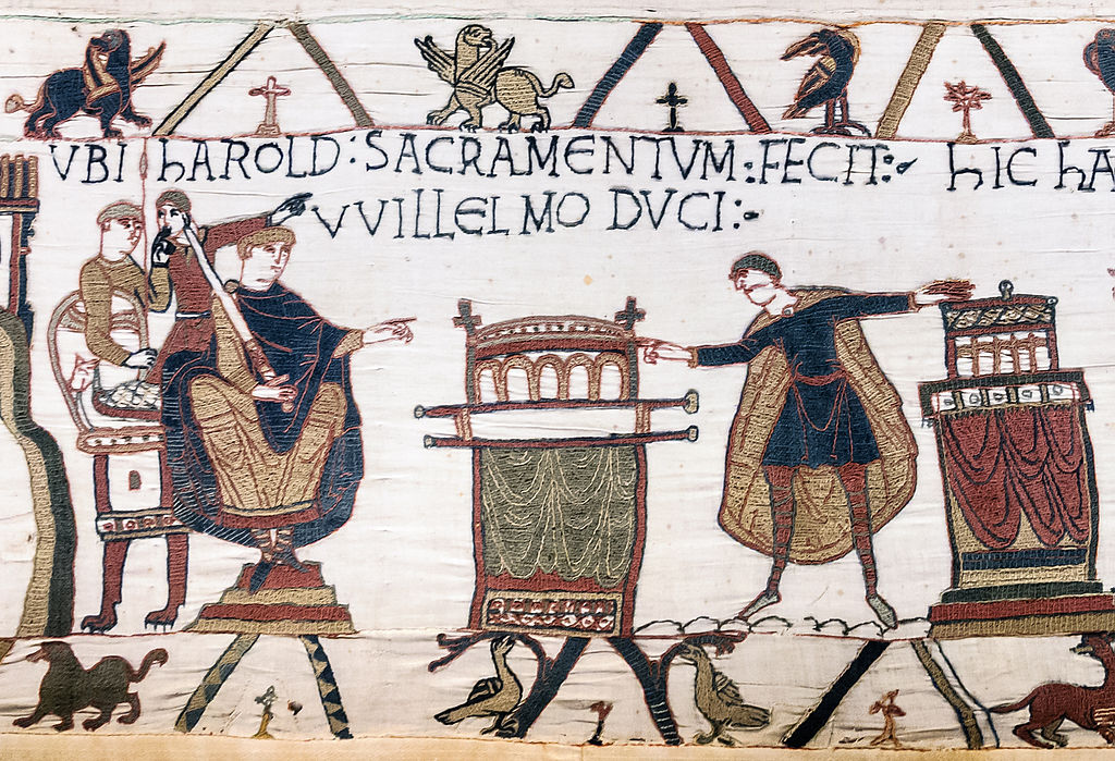
Scene 23: ‘Where [Bayeux] Harold made an oath to Duke William’.
Who produced it?
There are various theories regarding the origin of the embroidery, but the most convincing one is that it was created in the county of Kent; more precisely at the abbey of St Augustine in Canterbury. Firstly, in addition to being the bishop of Bayeux, Odo was earl of Kent, the south-eastern region of England well known for the skill of its seamstresses. In addition, the Latin captions feature various Anglicized spellings, and there are also certain inaccuracies depicted throughout the work: e.g. Anglo-Saxon infantry wore chainmail leggings, not Norman cavalrymen as the artisans would have us believe. Lastly, two of the most significant sections of the embroidery (Scenes 30 & 57) that portray the coronation and death of Harold, label him as rex (‘king’). This is a particularly important anomaly, for as the famous catalogue (Domesday Book, 1086) of King William’s territories in the kingdom of England made clear: William, not Harold, was Edward the Confessor’s legitimate successor, a claim reinforced by contemporary historians who variously referred to Harold as a perjurer or tyrannus (most notably by the Conqueror’s classically educated chaplain, William of Poitiers).
There are various theories regarding the origin of the embroidery, but the most convincing one is that it was created in the county of Kent; more precisely at the abbey of St Augustine in Canterbury.

Scene 54: Odo of Bayeux rallying fleeing cavalrymen at the Battle of Hastings.
How was the embroidery made?
The skilled embroiderers stitched the various scenes onto nine pieces of linen of varying degrees of length, and impressively the seams joining these sections together are quite literally seamless. Presumably to reinforce the 64m-long (211ft) embroidery, in 1724 it was affixed to an additional linen backing. Probably in the same century, numerals were added to delineate between the various scenes, a system still in use by historians. Given the remarkable vibrancy of the embroidery to this day, clearly only the best quality wool and dyes were used in its production. As will be related in a future blog post, England was well known for the production of premium quality wool. The dyes were probably made from vegetable extracts, and eight distinct colours have been identified. To use the words of eminent French scholar Lucien Musset, the colours used were ‘red, two shades of yellow, two of green, and three of blue (one of them almost black)’. As Musset further relates, two types of stitches have been detected: stem stitching for both the outlines and Latin captions, and the couched or laid stitch for everything else. There are also some sections featuring the chain stitch, but they are the product of modern restorative work. Although there is no evidence for the use of tracing on the original linen sections, it is feasible that the seamstresses used a smaller version as a guide, or perhaps a painting or sketch.
The dyes were probably made from vegetable extracts, and eight distinct colours have been identified.

Scene 6: Harold Godwinson; note stem (outline) and couched stitches (interior).
Further Reading
- The Gesta Guillelmi of William of Poitiers, ed. & trans. R.H.C. Davis & M. Chibnall, Oxford, 1998.
- R. Allen Brown, The Norman Conquest of England: Sources and Documents, Woodbridge, 1995.
- E. van Houts, The Normans in Europe, Manchester, 2000.
- L. Musset, The Bayeux Tapestry, trans. R. Rex, Woodbridge, 2005.
- M. Chibnall, The Normans, Oxford, 2006.
All images derive from Wikimedia Commons.
About the author
Dr Paul Brown specializes in ancient and medieval history, and is particularly interested in culture, language, and warfare. In addition to writing scholarly articles and chapters, his first book, Mercenaries to Conquerors: Norman Warfare in the Eleventh- and Twelfth-Century Mediterranean, will be published in 2016 by Pen & Sword Books.
10 Wondrous Properties of Wool.

We all know how wonderful wool is to work with and to wear, but did you know that wool also has natural UV protection or that it has anti-bacterial properties? This week we'll be looking at seven wondrous properties of wool, which I'm sure will make you love it even more.
#1. Wool has natural UV protection
Sheep wool has a natural UV protection factor of up to 30+! Wool naturally absorbs the suns UV rays before it can make contact with your skin; by wearing wool you will be protected against the sun harmful rays.
#2. Wool has antibacterial and antimicrobial properties
The thin waxy coating of wool fibre contains fatty acids that inhibit the growth of mold, mildew and bacteria. The same coating repels water that can cause mildew and mold to grow. This means that woolen items do not need regular washing and will smell fresh after repeated use, unlike synthetic fibres.
#3. Wool is stain resistant
The waxy outer coating of wool helps to repel liquids, meaning if you spill anything on your knitwear it is most likely to roll off, and what is left is easily wiped off.
#4. Wool is easy to care for
It's a well known fact that woolen items do not need regular washing. Bacteria causing odour is naturally inhibited by fatty acids that coat wool fibre. Static, which attracts lint, dirt and dust, is also inhibited by this waxy coating. The scaly surface area of fibre acts to block dirt and stains from being absorbed. Instead, particles sit on top which means they are much easier to remove.
#5. Keeps you warm in winter and cool in summer
Wool is renowned for its ability to regulate body temperature. In the winter, wool’s insulating qualities trap dry air and warmth near the skin. Wool's natural insulating quality and its ability to shed water results in a fabric that keeps the body warm, even when it's raining. In the summer, wool’s coil-like shape pulls excess heat and moisture from your skin, helping the wearer to stay cooler.
#6. Insulates even when wet
The inner core of wool fibers can absorb just under half of its own weight in moisture. Not until wool is saturated with 60% of its own weight will it feel wet to the touch. Since it retains 80% of its insulating value even when saturated, wool will keep you warm even when wet. This fact reminds me of the Gansey fisherman sweaters, which I'm sure have saved many lives.
#7. Wool is durable
Wool can withstand being bent 20,000 times without breaking. In comparison, cotton breaks after 3,000 bends, silk after 2,000, and rayon can only be bent 75 times without breaking. Its natural elasticity means that the fibres are less likely to break, and fabric made from wool less likely to tear. The ability of wool to "spring back" into shape, means that woolen garments tend to retain their shape better than garments made from other fibres.
How To Select Eye-Catching Colour Combintations - Part 3. Finding Inspiration

There are so many places to source inspiration for colour combinations, whether it be online, in print or from the surrounding environment. You'll be surprised to find that if you start consciously looking, you'll begin to see colour palettes everywhere. In today's post, we'll be exploring some of the places you can go to find colour inspiration.
Online
The World Wide Web - what a fantastic source of information and inspiration! There are so many websites dedicated to colour; it's hard to narrow them down to a few. But here are some of my favorites.
A fantastic resource for colour combinations, Design Seeds uses photos to create colour palettes.

Browse thousands of colour palettes or create your own! COLOURlovers also helps you keep up with colour trends, plus they have a great blog.

Adobe Colour Wheel is a fantastic online tool for creating colour palettes.

Create a colour mood board and pin pictures that you love onto it. You can then refer to it later when looking for colour inspiration.

Print Media
Magazines are a fantastic source of colour inspiration: I find fashion, lifestyle and design magazines are particularly good for finding colour inspiration. Here are a few of my favourites.


Surrounding Environment
Whether you live in the country, by the sea or in the middle of a bustling city, the environment that surrounds you is packed full of colour inspiration. From nature to man-made structures, photograph whatever catches your eye and use the resulting images for colour palette inspiration. There are online colour palette generators that can help you to create colour swatches from your images (like Pictaculous), or use imaging editing software like Photoshop to make your own.

And don't forget to share them with others through social sites like Pinterest, Instagram or Tumblr.
To Sum it all up
- Search for colour inspiration online via websites and social sites.
- Find loads of inspiring colour ideas through magazines and other print media.
- Look around where you live for colour swatch ideas; keep a record of them by taking pictures and creating swatches.
And that is the end of our series! As always, if you've found this post or the series useful, please be sure to let me know in the comments below, and feel free to share it with your fibre-loving friends.
How To Select Eye-Catching Colour Combintations - Part 2. The Colour Wheel

Planning your colour scheme for colourwork projects can be difficult. Knowing exactly which colours to put together to form a pleasing colour arrangement can be a very daunting task. Not any more! This week we'll be exploring the colour wheel and explaining why this simple little colour map should become your 'go-to guide' for selecting amazing colour combinations.
So, how can a colour wheel help when choosing colours for colourwork? According to colour theory, harmonious colour combinations (or colour schemes) can be found on a colour wheel by simply using a number of formulas. Knowledge of these formulas will give you immeasurable help when selecting colours for colourwork, or any project that uses more than one colour. Once you get the gist of it, you'll find yourself using these formulas without even thinking about it. There are many formulas, but we will be concentrating on monochromatic, analogous, diad, triad, complementary, split complementary and tetradic. We'll look at the pros and cons of each formula, as well as suggesting some tips that you might find helpful when knitting with each of these colour schemes.
The colour wheel is often left out of a knitter's tool kit. Why not get one to put in your notions case or, even better, get an app for your phone or tablet? That way you'll always have one on hand.
Monochromatic Colour Combinations

Monochromatic colour combinations consist of colours ranging from light to dark within a single hue (for example, blue).
Pros
- Selecting colours for this type of colour scheme is easy and the results are subtle, yet very pleasing.
- Allows you to choose a number of different colours: i.e. you're not restricted to just two or three.
- Produces a balanced, calming effect.
Cons
- Very low in contrast - you need to make sure that the colours you chose differ significantly in tone (see part 1.)
Tip! To test for contrast, twist all colour strands together. If the colours merge together, you'll know there is not enough contrast.
Analogous Colour Combinations

Colours placed next to each other on the colour wheel make up an analogous colour combination. These type of colour combinations are often found in nature and are very pleasing to the eye.
Pros
- Just like monochromatic colour combinations, they are easy to select.
- This color scheme looks a lot more vibrant than monochromatic colour combinations.
- You can choose as many colours as you like.
Cons
- These colour schemes can lack contrast, so it's vital that you make sure that there is enough variation in tone for your colourwork project to pop!
Tip! Avoid using warm and cool tones together in analogous colour combinations.
Diad Colour Combinations

Diad colour combinations are made up of two colours, found two steps apart from each other on the colour wheel.
Pros
- These look great in colourwork and are perfect for those who are wanting a colour scheme that is less vibrant than complementary colours.
- A simple colour scheme that is easy to put together.
Cons
- The contrast between colours is not as strong as complementary.
- Limited to two colours.
Triadic Colour Combinations

Triadic colour combinations are made up of three colours that are spaced evenly around the colour wheel.
Pros
- Gives you a nice balance of colour that is high in contrast.
- These colour combinations tend to be quite vibrant, even if you use pale or unsaturated hues.
Cons
- Not as vibrant as split complementary colour schemes.
- Limited to three colours.
Tip! To use this colour combination successfully, let one colour dominate and use the other two as accents.
Complementary Colour Combinations

Complementary colours are found on opposite sides of the colour wheel.
Pros
- When used together, these colours create vivid and bright colour combinations, more so than any of the other combinations we have looked at.
- Fabulous for stripes.
Cons
- Can be jarring and hard on the eyes. To help ease this, make sure you use different tones (e.g. a light colour paired with a dark).
- Limited to two colours.
Tip! When using complementary colours, try placing warm tones next to cool.
Split Complementary Colour Combinations

Split complementary colours are a variation of the complementary colour scheme: one colour is paired with two colours that are on either side of the complementary colour.
Pros
- Perfect for three-colour knitting.
- Provides a high contrast between colours.
- This type of colour combination is hard to mess up and almost always results in a pleasing colour scheme.
Cons
- May be harder to create a balance between colours. If so, you may be better off trying the monochromatic or analogous colour combinations.
- Limited to three colours.
Tip! To highlight warm tones in your project, use a single, warm colour against two cool, OR if you want the cool colour to take center stage, place it next to two warm colours.
Tetradic Colour Combinations


Tetradic colour combinations are also known as double complementary because you are using two pairs of complementary colours. The first picture shows a rectangular colour scheme, the second is a square.
Pros
- Creates a rich and vibrant colour scheme.
- Lots of contrast.
Cons
- This is the hardest of all colour schemes to balance.
- Limited to four colours
Tip! To help balance this colour combination, make sure you have an equal amount of warm and cool colours.
Cool and Warm Colours

Colour wheels are split into two sections: cool colours on one side, warm colours on the other. Selecting a balance of these colours means making sure that you have the same number of colours on either side of the colour wheel. Mixing warm and cool tones works especially well with triadic, complementary, split complementary and tetradic colour combinations but should be avoided in analogous colour combination.
Tone
I know I spoke about tone last week, but I again wanted to emphasise its importance within a colour scheme. The colour wheel pictures that I have used do not show tone; there are colour wheels out there that do, like this one. If you're looking to get one, try and find one that illustrates tone. Using the above colour formulas and combining those with your knowledge of tone will, without a doubt, produce eye-catching colour combination.
Using Neutrals

Neutrals don't appear on the colour wheel but they make wonderful additions to any colour combination. Neutral colours are shades of grey, black, white and sometimes brown and beige. Try adding one or more neutral colours to any of the above combinations to liven them up and expand you colour palette. The example above shows a split complementary colour combination with grey.
To Sum it all up
- The colour wheel is an important tool that will help you choose harmonious colour combinations.
- Keep in mind the pros and cons of each colour formula when selecting colours for colourwork.
- Never forget to vary tone within a colour combination; this is really important for the overall success of your colour scheme.
- Try adding neutral colours to your colour scheme; they help to liven up your colours and expand your color palette.
I hope you have found this post helpful! Next week we'll be looking at where to find inspiration for colour combinations and how to use this inspiration when selecting colours for eye-catching combinations. If you've found this post useful, please let me know in the comments below and be sure to share it with your fibre-loving friends.